By Dr. Tatiana Rosenstein
Huh Hwe-tae (also known by his artistic name, Moosan, where moo means “exuberant” and san “mountain”) is a well-known Korean calligrapher and contemporary artist. Exploring Chinese calligraphy, Huh goes beyond traditional writing and rises to a new level of artistic expression by using new forms that he has invented. Over time, his work takes on more abstract forms, inspired by art and nature, created by man and without him. Focusing on emotions, moods, and a different state of mind, he departed from the fixed notion of the objects in calligraphic art, breaking away from the restraint imposed by them and exploring his own artistic freedom. In a way, he expresses himself by uniting his emotions with a brush.
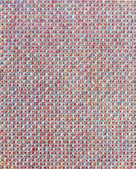
In 2005, Huh Hwe-tae made his breakthrough transforming his two-dimensional calligraphic murals into three-dimensional art objects, some of which can be described as sculptures. However, we are not talking about traditional sculptures, although the artist creates his objects by modeling, adding material to canvas. This new form that merges calligraphy and painting is called “emography” (emotion + graphy), which transcends the boundary of the modern distinction between writing and drawing/painting. Huh complements the surfaces of his compositions with text and picture elements, producing works with paper that can be seen as “bas relief.” He uses traditional Korean hanji, twisting it into small forms that are covered with finely scribbled calligraphic signs. Hanji refers to paper handmade with mulberry bark that is thin and translucent, easy to press, starch, or fold when it is still not completely dry. It affords great freedom of creation. Huh describes his work process as follows:
“First, I write many words and sentences relevant to the theme I have in mind on a small piece of paper, then I wrap them around styrofoam divided into four pieces – the four cardinal points – with papers individually and glue them on a canvas one by one manually. This process looks to me like a process of creating the universe. At first, many tiny, meaningless pieces are integrated together to bloom. The manual process looks like I am planting the codes of emotions to seamlessly communicate with people.”
Immersed and formed in a specific socio-ethnic cultural layer, every artist creates work based on the experience of his social space for certain viewers, focusing on the cultural symbols and representations of society. To understand the art of Huh Hwe-tae and what shaped the artist’s views, it is necessary to place his work in historical context. An important milestone in changing the minds of Koreans was the year 1987, as it marked the activities of the resistance movement, whereupon the citizens of the Republic of Korea were finally able to achieve the establishment of democracy. For national art, this meant the spread of pluralism, postmodern trends, and the opportunity to discover international art, preserving at the same time the originality of their own culture. The trends are reflected in new features like the desire for pure abstraction or emphasized expressiveness inspired by similar movements in Europe, particularly in France, where they are known as art informel. The influence of American art, in particular action painting, undoubtedly built on a heritage of the most prominent representative of the genre, Jackson Pollock, should not be underestimated as well. Protests against academic art came to Korea at the end of the 1960s. They were led by representatives of the informel movement. For example, there was the street display of avant-garde works on the walls of Gyeongbok Palace, while the exhibition of nominees for the National Art Exhibition was held nearby. According to the ideas of informel artists, the affectivity and spontaneity of art works are more important than their rationality.
The largest experimental movement in Korean art, in the 1970s, was dansaekhwa (단색화), where style is characterized through monochrome painting and flatness. The style at first glance resembles the color field painting of Mark Rothko or Clyfford Still. Neither Korean nor American artists depict anything specific, but instead utilize monochrome color fields. By closely examining dansaekhwa paintings, one can see the surface, which is composed of numerous textures, including the repeated application and removal of smears. Representative dansaekhwa can be explained as removing paint from the canvas with repeated pencil strokes or scraping and then redoing parts of the paintings, using ideas from the ancient Eastern philosophical schools, in particular Buddhism, in which techniques were compared with the long and painful meditations of Buddhist monks. In the history of the Korean experimental art of the 1970s, we should mention associations like the Korea Avant-garde Group (AG) or the Fourth Group. Their representatives were looking to blur the boundaries between art and everyday life, paying particular attention to new ways of creative expression by freeing art from limited formats such as flat paintings or sculptures on a pedestal.
The confrontation between the avant-garde groups and conservative artists ended in a victory for the latter, which resulted in the emergence of schools like Minjung (people’s) art in the 1980s. However, the avant-garde movements undoubtedly left traces in the history of Korean art which led to new experiments even by representatives of new conservative trends who tried to discover different forms of figurativeness. Perhaps the hyperrealism of the new direction can be compared to pop art in Western art; however, Korean artists were more interested in subjective emotions and symbolism. While Western paintings were keen on transmitting the cult of modern society, Korean paintings turned mostly to nature, devoid of human figures as if they intended to metaphorically indicate the existence of people, instead of cultivating their presence as artists in the West often preferred. In the 1990s, the era of globalization of Korean contemporary art began. The artists started to travel abroad more often, sometimes undergoing training there.
Huh Hwe-tae was born in 1957, at a time when protests against academism in Korean art began. Perhaps he chose a more secure path by studying calligraphy rather than art. According to the artist himself, he was just too keen on calligraphy. He created his first works at the age of only five. Known as a child prodigy, he collected his first awards in calligraphy contests at the age of 15. His first solo exhibition was organized while he was still attending high school. When the globalization of contemporary Korean art emerged internationally and the local art scene was opening up to the pluralism of opinions and joys of experimentation, Huh was in his late 30s. Towards the mid-1990s, he had mastered all the styles known in calligraphy. The time finally came when he wanted to create something new:
“During that time, I was thinking of the legendary calligrapher of the Joseon Dynasty Kim Jeong-hui and his Chusa style. I thought there was no way I could surpass him with the existing styles, no matter how well I imitated him. I needed to start something new that was demanded in my time. I focused on the fact that most letters are considered as nothing more than just letters used within certain countries. They could not be communicated globally. So, I tried to capture imagery in letters that would go global.”
His new form of art is a mix of calligraphy, painting, and sculpture. It was influenced equally by nature as well as by human beings. Engaged with emotions and intuition, he adopted one form of human communication – language – by transforming it into another one based on the universal instincts of people, their thoughts, and feelings. He discovers eroticism rooted in the human desire of existing and making things exist. He searches for temptation and naturalness that is not governed by ideas, thoughts or ethics. In his “emosculptures” (emotion + sculpture), we sense the icons of the vulva as a universal source of life and creation, desire, pain, and pleasure. His early work is mostly monochrome. This choice could be an influence from calligraphy. However, restraint in colors was also inherent in the work of many Korean artists in the 1970s and early 1980s. Like them, Huh was also inspired by Eastern philosophy and Buddhism, exploring cycles of birth and rebirth, the concepts of reincarnation and transmigration. Sometimes the similarities of styles are not resulting from direct influence; the artist’s views are rather shaped by the zeitgeist.
I first visited the artist’s studio on my third trip to Korea. In Seoul’s Gangnam District, a cozy space filled with brushes and paper samples, books, heavy catalogues, and graphic work, in addition to paintings, sculptures, and “emographic” (emotion + graphic) pieces. Everything felt to be in order, harmonious, and simplistic. The artist was preparing for a new exhibition, selecting works and pondering concepts.
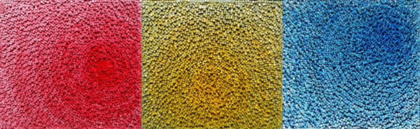
My attention was drawn to a canvas. Its surface was divided into three equal parts covered by the colors blue, red, and yellow (according to the artist, yellow stands for “belief,” red for “passion,” and blue for “peace and stability”). It looked abstract, living in its own reality. It recalled similarities with the art performed by minimalists in a highly purified form of beauty. Stepping closer, I saw how the colors were blurring towards the edges while surfaces appeared to be moving and swirling like a whirlpool. The centers of those whirls were shifted sometimes to the right and sometimes down, building a rhythmic vortex of spaces, lines, and masses. Upon even closer inspection, I suddenly noticed that parts of the canvas were composed of tiny volumes hand-scripted by the artist. Countless reliefs – a painstaking, miniature work like handcrafted jewelry – together created a huge network. In their multiple layers and semantic diversity, they nevertheless created absolute harmony. From here on, the object still appeared abstract but becoming more conceptual. I was told the title of the series was “The Flower of Life.” The name was an art narrative within itself – now, in these abstract forms, I could imagine flowers or diverse elements of nature. The numerous lines depicting different shapes and surfaces seemed to form a third dimension. The viewer did not feel bored to peer into this endless universe, the riddle of which seemed solvable at the same minute when it immediately disappeared from view, creating new semantic interpretations.
In a piece I saw next was a lot of indigo resembling a water surface with stains as if left from a boat that had just sailed here. Some of the canvases were more monochrome, like the one with the title “The Echo of the Heart, No. 5.” Another, with a similar composition but made in a more colorful combination, reminded me not only of blooming flowers but of the glowing sun or even a wheel of all life. These works could rightfully be called sculptures, because everything down to the smallest details was molded by the artist’s hands. The artist explains what was depicted:
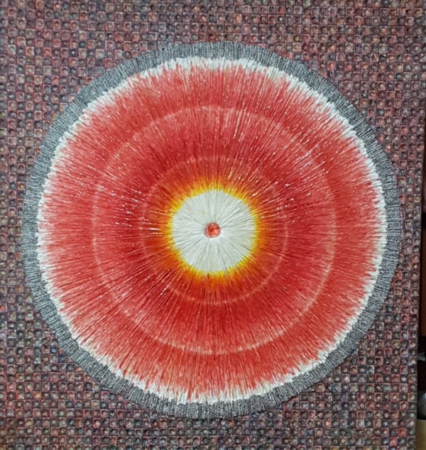
“I wanted to draw attention to particles that rush towards the center, which are marked with a gem placed in the middle, emitting intense light reflected in a homogenous space. This center becomes a symbolic heart of a person reflecting actions and feelings of its owner. It contains thoughts about me, nature, and myself in the space. The beginning of every work is a story of the universe where people build their ideas, expressing desires, giving and taking, asking and receiving answers. I wanted to create pieces that spread energy and feel like the breath of life.”
Some of the objects included in the upcoming show I could only see in pictures, like the installation “Emergency, Non-emergency.” Several outlandish, free-standing forms placed one by another reminded me of human figures multiplying and constantly increasing into crowds. The forms had floral motifs including also diverse symbols like female body parts, outlines of a baby, and the conventional process of life creation.
Huh Hwe-tae’s new works are complex. They contain several styles that I can recognize in both contemporary Korean as well as Western art. The traditions of monochrome and flatness seen in avant-garde Korean art of the 1970s can be clearly traced here as well, with tendencies toward action painting – especially by recalling numerous artists’ performances with brush and ink – or toward conceptual art, where the whole work is subject to one idea. Focus on emotions is a legacy of abstract expressionism. Art has become a global phenomenon. The diversity of Huh’s art and his numerous experiments speak to his curiosity and tireless joy in researching life. Maybe historians and art critics are driven by a desire to explain art; they strive for an accurate analysis of works of art in order to organize it. A regular viewer is not required to do so because art can also be reflected by using the nature of emotions. This is precisely what Huh Hwe-tae hopes to achieve, namely, that a perception may unexpectedly lead to infinite imaginations and touch people’s hearts.
The Author
Dr. Tatiana Rosenstein teaches art history with a focus on contemporary art. She is a film scholar who has been reporting on international film festivals, design and fashion events as well as major art events for German-speaking and foreign media since 1999 and is active on juries of critics. She writes articles in several languages, with her work appearing in publications from Europe and Russia to China and Korea. Email: info@kino-kunst.de
*This article was originally published in Gwangju News April 2021 issue.
Gwangju News is the first public English monthly magazine in Korea, first published in 2001 by Gwangju International Center. Each monthly issue covers local and regional issues, with a focus on the stories and activities of the international residents and communities. Read our magazine online at: www.gwangjunewsgic.com
원문 해석
무산 허회태를 통해 본 감정의 본질
글쓴이: 타티아나 로젠슈타인 박사
사진: 허회태
허회태 (예명 무산으로도 알려져 있는데, 여기서 무는“풍부하다”를 의미하고 산은 “산”을 의미함)은 한국의 유명한 서예가이자 현대 예술가이다. 중국 서예를 탐구하는 그는 자신이 발명한 새로운 형식을 사용하여 전통적인 글쓰기를 넘어 예술적 표현의 새로운 수준에 도달한다. 시간이 지남에 따라 그의 작품은 예술과 자연에서 영감을 받고 그는 없이 인간에 의해 창조되어 더 추상적인 형태를 취한다. 감정과 기분 그리고 마음의 여러 다른 상태에 집중하면서 그는 서예 예술에서의 사물의 고정 된 개념에서 벗어나 그들에 의해 주어진 억압된 구속으로부터 떨어져 나가 자신만의 예술적 자유를 탐구했다. 어떤 의미에서 그는 자신의 감정을 붓과 하나로 만들어 자신을 표현한다.
2005년 허회태는 자신의 2차원적인 서예 벽화를, 어떤 것은 조각이라 설명될 수 있는 3차원적인 예술 작품으로 획기적인 변형을 하게 된다. 작가가 자신의 대상을 모델링하고 캔버스 위에 재료를 더한다고 하나 여기서 우리는 전통적인 조각을 얘기하는 것이 아니다. 서예와 그림이 융합된 새로운 형태인 이모그래피(감성 + 서예)로 현대적 구분인 쓰기와 그리기의 경계를 초월한다. 그는 자신의 구성작품의 표면을 글씨와 그림 요소로 보완하여 버스-리리프(*두께가 얕은 부조(浮彫))로 보일 수도 있는 종이작품을 표현한다. 그는 한국의 한지를 이용해 꼬아서 세밀하게 흘려 쓴 서예적 기호로 뒤덮인 작은 형태로 만든다. 한지는 닥나무 껍질을 원료로 손으로 만든 종이를 말하는데 얇고 투명하고 아직 완벽하게 마르지 않았을 때는 누르고 풀칠하거나 접기가 쉽워, . . 자유자재로 창조가 가능하게 한다. 그는 다음과 같이 자신의 작업 과정을 설명한다.
“먼저, 작은 종이에 생각해 둔 주제와 관련된 많은 단어와 문장을 써보고 그것들로 4개로 나눈 스티로폼을 쌉니다. 4개의 기본 포인트는 종이로 각각 감싼 뒤 풀을 사용해 캔버스에 하나씩 손으로 붙입니다. 이 과정은 제겐 우주를 창조하는 과정처럼 보입니다. 처음에는 매우 작은 많은 의미 없는 조각들이 피어나기 위해 하나로 융합되지요. 손으로 하는 과정은 사람들과 원활하게 소통하기 위해 감정의 코드들을 심는 것처럼 보입니다. “
특정 사회 민족적 문화층에 얽혀져 형성되는 모든 예술가는 자신의 사회적 공간에서의 경험에 기반을 두고 사회적 상징과 사회를 대표하는 것에 중점을 두고 특정한 관중을 위해 작품을 창작한다. 허회태의 예술과 무엇이 작가의 관점을 형성했는가를 이해하기 위해서는 그의 작품을 역사적 맥락에 두어야 할 필요가 있다. 한국인들의 마음을 바꾸는 중요한 획기적인 사건은 1987년이었는데, 이것이 저항 운동의 활동으로 자리매김하면서 대한민국의 국민들은 마침내 민주화를 이루게 되었다. 국가적 예술의 경우, 이는 다원주의의 확산, 포스트모던 주의 트렌드, 자신들의 문화의 독창성을 보존하는 동시에 국제적인 예술을 발견할 기회를 의미했다. 이러한 추세는 순수 추상화에 대한 욕구 나 특히 앵포르멜 예술로 알려진 프랑스의 유사한 움직임에서 영감을 받은 강한 표현주의를 향한 갈망과 같은 새로운 기능에 반영됐다. 미국 예술, 특히 액션 페인팅의 영향은 의심할 여지 없이 장르를 대표하는 가장 유명한 잭슨 폴록의 유산을 기반으로 하여도 과소 평가되어서는 안 된다. 1960 년대 말 한국에 학술적 예술에 반대하는 시위가 시작됐다. 그것들은 비공식 운동의 대표자들이 이끌었다. 예를 들어 인근에서 국립 미술전 후보자들 전시가 열리는 중 경복궁 벽면에는 아방가르드 작품의 거리 전시가 있었다. 엥포르멜 예술가들의 생각에 따르면 예술 작품의 합리성보다 영향성과 자발성이 더 중요하다.
1970년대 한국 미술에서 가장 큰 실험 운동은 단색화로 모노크롬 페인팅과 평평함을 통해 스타일을 특징 짓는다. 언뜻 보기에 스타일은 마크 로스코 또는 클리포드 스틸의 컬러 필드 페인팅(*단순한 컬러로 많은 영역을 칠한 추상적인 캔버스가 특징)을 닮아있다. 한국 작가나 미국 작가 모두 구체적인 것을 묘사하지 않고 대신 단색 색상 필드를 활용한다. 단색화 그림을 면밀히 살펴보면 반복되는 도포와 번짐 제거 등 수많은 질감으로 구성된 표면을 볼 수 있다. 대표 단색화는 연필로 칠을 반복하거나 긁어내고 그림의 일부를 다시 칠하는 것으로 설명 할 수 있는데, 이 기법은 고대 동양 철학, 특히 불교 승려의 길고 고통스러운 명상과 비교한 것이다. 1970 년대 한국 실험 미술사에서 한국 아방가르드 협회(AG)나 제 4집단과 같은 협회를 언급해야 한다. 그들 대표들은 평면화나 받침대 위의 조각과 같은 제한된 형식에서 예술을 해방해 새로운 창의적 표현 방식에 특히 주의를 기울여 예술과 일상생활의 경계를 허물고자 했다.
아방가르드 집단과 보수 예술가들의 대결은 후자의 승리로 끝이 나고 1980년대 민중(대중의) 예술과 같은 그룹이 등장했다. 그러나 아방가르드 운동은 의심할 여지없이 한국 미술사에 흔적을 남겼고, 다른 형태의 비유성을 발견하려는 새로운 보수적 트렌드의 대표자들조차 새로운 실험을 끌어냈다. 아마도 새로운 방향의 초현실주의는 서양 미술의 팝아트와 비교할 수 있을 것이다. 그러나 한국 예술가들은 주관적인 감정과 상징에 더 관심이 많았다. 서양화는 근대 사회의 숭배를 전수하는 데 열중했지만, 한국화는 서구의 예술가들이 자신의 존재를 찾는 것을 자주 선호하는 대신에 마치 민중의 존재를 은유적으로 나타내려는 것처럼, 인간의 모습이 없는 자연으로 돌아섰다.. 1990 년대, 한국 현대 미술의 세계화 시대가 시작되었다. 예술가들은 더 자주 해외여행을 시작했으며 때로는 그곳에서 훈련을 받았다.
허회태는 1957년 한국 미술 학계에 대한 저항이 시작된 시기에 태어났다. 아마도 그는 예술보다는 서예를 공부함으로써 더 안전한 길을 택했을 것이다. 작가 자신에 따르면 그는 단지 서예에 너무 열정적이었다. 그는 겨우 5살 때 첫 작품을 만들었다. 어린 신동으로 알려진 그는 15세에 서예 대회에서 첫 상을 받았다. 그의 첫 개인전은 그가 아직 고등학교에 다니는 동안 준비됐다. 한국 현대 미술의 세계화가 국제화되고 지역 미술계가 의견의 다원주의와 실험의 즐거움에 열리고 있을 때 그는 30대 후반이었다. 1990 년대 중반까지 그는 서예에 알려진 모든 스타일을 마스터했다. 마침내 그가 새로운 것을 만들고 싶을 때가 왔다.
“그때는 조선 시대 전설적인 서예가 김정희와 그의 추사 풍을 생각하고 있었습니다. 아무리 잘 모방해도 기존 스타일로 그를 능가 할 수는 없다고 생각했지요. 저는 제 시대에 요구되는 새로운 것을 시작해야 했습니다. 저는 대부분 문자가 특정 국가에서 사용되는 글자에 지나지 않는다는 사실에 집중했습니다. 그들은 전 세계적으로 소통될 수 없었지요. 그래서 전 세계에 퍼질 수 있는 글자로 이미지를 포착하려고 했습니다.”
그의 새로운 형태의 예술은 서예, 회화 및 조각의 혼합이다. 그것은 인간뿐만 아니라 자연의 영향을 똑같이 받았다. 감정과 직관에 관련해서 그는 인간의 보편적인 본능과 생각, 감정을 바탕으로 한 인간 소통법의 한가지인 언어를 다른 형태로 변환하는 데 사용했다. 그는 존재하고 존재하게 만드는 것에 대한 인간의 욕망에 뿌리를 둔 에로티시즘을 발견한다. 그는 아이디어, 생각 또는 윤리에 좌우되지 않는 유혹과 자연스러움을 찾아본다. 그의 "이모스컬프쳐(감정 + 조각)"에서 우리는 외음부 아이콘을 생명과 창조, 욕망, 고통, 즐거움의 보편적인 원천으로 감지한다. 그의 초기 작품은 대부분 단색이다. 이 선택은 서예의 영향일 수도 있다. 그러나 1970 년대와 1980년대 초반 많은 한국 작가들의 작업에는 색채의 제한이 타고난 것이었다. 그들처럼 허회태도 동양 철학과 불교에서 영감을 받아 생과 재탄생의 재생 순환을, 환생과 윤회의 개념을 탐구했다. 때로는 스타일의 유사성이 직접적인 영향으로 인한 것이 아니다. 예술가의 견해는 오히려 시대 정신에 의해 형성된다.
나는 세 번째 한국 여행에서 작가의 스튜디오를 처음 방문했다. 서울 강남구의 아늑한 공간으로 붓과 종이 견본, 책, 무거운 카탈로그, 그래픽 작품, 그림에, 조각, '에모 그래픽'(감정 + 그래픽)으로 가득 차 있었다.
모든 것이 질서 있고 조화롭고 단순하다고 느껴졌다. 작가는 작품을 선택하고 개념을 숙고하며 새로운 전시를 준비하고 있었다.
나의 관심은 캔버스에 끌렸다. 그 표면은 파란색, 빨간색, 노란색으로 덮인 균일한 세 부분으로 나누어졌다 (작가에 따르면 노란색은 '믿음', 빨간색은 '열정', 파란색은 '평화와 안정'을 의미). 그것은 그 자체의 현실에 사는 추상적인 것처럼 보였다. 그것은 고도로 정제된 아름다움의 형태로 미니멀리스트가 수행한 예술과의 유사성을 기억나게 했다. 가까이 다가가면서 표면이 소용돌이처럼 움직이며 빙빙 도는 것처럼 보이면서 가장자리 쪽으로 색상이 흐릿해지는 것을 보았다. 소용돌이의 중심은 때때로 오른쪽으로 이동하고 때로는 아래로 이동하여 공간, 선 및 질량의 리드미컬 한 소용돌이를 형성했다. 더 자세히 살펴보니 캔버스의 일부가 작가가 손으로 쓴 아주 작은 덩어리로 구성되어 있음을 순간 알아차리게 되었다. 손으로 만든 장신구처럼 공들인 세밀한 작품의 셀 수 없는 안도감과 함께 거대한 네트워크를 형성했다. 여러 계층과 의미적 다양성에도 불구하고 절대적인 조화를 이루었다. 여기서부터는 그 대상은 여전히 ​​추상적으로 보였지만 좀 더 개념적으로 변했다. 나는 시리즈의 제목이“생명의 꽃”이라고 들었다. 그 이름은 그 자체로 예술적인 설명이었다. 이제 이러한 추상적인 형태에서 꽃이나 자연의 다양한 요소를 상상할 수 있었다. 다양한 모양과 표면을 묘사하는 수많은 선이 3차원을 형성하는 것처럼 보였다. 관객은 끝없는 우주를 들여다보는 데 지루함을 느끼지 않았습니다. 그 우주의 수수께끼는 즉시 눈앞에서 사라져 새로운 의미적 해석을 만들어내는 바로 그 순간 풀 수 있는 것처럼 보였다.
그 다음에 본 작품에는 얼룩이 있는 수면을 닮은 많은 쪽빛이 방금 여기에 항해 한 배에서 남겨진 것처럼 있었다. 일부 캔버스는 "The Echo of the Heart, No. 5"라는 제목의 캔버스처럼 더 단색이었다. 비슷한 구성이지만 더 화려한 조합으로 만들어진 다른 하나는 꽃이 피는 것뿐만 아니라 빛나는 태양, 심지어는 모든 생명의 바퀴를 생각나게 했다. 이 작품들은 조각이라고 할 수 있을 정도였다. 아주 작은 세부 사항까지 모든 것이 예술가의 손으로 만들어졌기 때문이다. 묘사 된 내용을 작가는 설명한다.
“중앙을 향해 돌진하는 입자들에 주목하고 싶었는데, 중앙에 보석이 배치되어 균일한 공간에 반사되는 강렬한 빛을 내보냅니다. 이 중심이 주인의 행동과 감정을 반영하는 한 사람의 상징적인 심장이됩니다. 그것은 나, 자연, 우주에서의 나에 대한 생각을 담고 있습니다. 모든 작업의 ​​시작은 사람들이 아이디어를 만들어가고, 욕구를 표현하고, 주고 받고, 질문하고 답하는 우주의 이야기입니다. 에너지를 퍼뜨리고 생명의 숨결처럼 느껴지는 작품을 만들고 싶었습니다.”
다가오는 전시에 포함된 일부 작품들은 “긴급, 비응급”설치와 같이 사진에서만 볼 수 있었다. 여러 가지 색다르고 독립적으로 나란히 배치된 형태는 개체가 늘어나는 인간의 형태와 끊임없이 군중으로 증가하는 것을 생각나게 했다. 형태는 여성의 신체 부위, 아기의 윤곽, 전통적인 생명 창조 과정과 같은 다양한 상징을 포함한 꽃 모티브가 있었다.
허회태의 신작은 복잡하다. 한국 현대 미술과 서양 미술 모두에서 내가 알아볼 수 있는 몇 가지 스타일을 담고 있다. 1970 년대 아방가르드 한국 미술에서 볼 수 있는 단색과 평평함의 전통은 여기에서도 확실하게 찾아볼 수 있다. 붓과 먹이 함께한 특별히 많은 작가의 행위를 회상해 보면 액션 페인팅에 가까운 경향이 보이고 작품 전체가 한 아이디어에 따라 달라지는 것은 개념예술의 경향이 보인다. 감정에 집중하는 것은 추상 표현주의의 유산이다. 예술은 세계적인 현상이 되었다. 허회태의 예술과 수많은 실험의 다양성은 그의 호기심과 삶을 연구하는 지칠 줄 모르는 기쁨을 얘기한다. 아마도 역사가들과 미술 평론가들은 예술을 설명하려는 욕망에 이끌리고 그것을 정리하기 위해 예술 작품의 정확한 분석을 위한 노력을 한다. 한 사람의 평범한 관람자는 그럴 필요가 없다. 왜냐하면, 예술 또한 감정의 본질을 이용하여 반영될 수 있기 때문이다. 이것이 정확하게 허회태가 이루고자 하는 것으로, 즉 인식이 뜻밖에 무한한 상상력으로 이어지고 사람들의 마음을 감동하게 할 수 있다는 것이다.
글쓴이
타티아나 로젠슈타인 박사는 현대 미술에 초점을 맞춘 미술사를 가르친다. 1999 년부터 국제 영화제, 디자인 및 패션 행사, 독일어권 및 외국 언론을 대상으로 한 주요 예술 행사를 보도해온 영화학자이며 비평가 심사 위원으로 활동하고 있다. 그녀는 몇 개의 언어로 기사를 쓰며 그녀의 글은 유럽과 러시아에서 중국과 한국까지여러 출판물에 게재된다.
이메일 : info@kino-kunst.de
번역자 민은 2013년 4월부터 때때로 광주국제교류센터 번역 자활로 활동해 오고 있다.
*이 글은 광주뉴스 2021 4월호에 실린 내용입니다.
광주뉴스는 광주국제교류센터가 2001년에 처음 발행한 대한민국 최초의 영문 대중월간지입니다. 매월 발행되는 각 호에는 지역에 거주하는 외국인과 지역민의 활동과 지역사회의 이야기 및 이슈를 다루고 있습니다. 온라인에서도 잡지를 볼 수 있습니다. (www.gwangjunewsgic.com)